Dialog alert with RFlutter Alert Package – Flutter Dialog Alert
- admin
- 0
- on Sep 18, 2022
This article we will user RFlutter Alert Package to create custom alert message with easy step.
RFlutter Alert is super customizable and easy-to-use alert / popup dialogs for Flutter. You may create reusable alert styles or add buttons as much as you want with ease.

Source Code
- pubspec.yaml
environment:
  sdk: ">=2.16.2 <3.0.0"

dependencies:
  flutter:
    sdk: flutter

  cupertino_icons: ^1.0.2
  rflutter_alert: ^2.0.4
  get:
2. alert_page2.dart
import 'package:flutter/cupertino.dart';
import 'package:flutter/material.dart';
import 'package:rflutter_alert/rflutter_alert.dart';
class DialogPage1 extends StatelessWidget {
const DialogPage1({Key? key}) : super(key: key);
@override
Widget build(BuildContext context) {
return Scaffold(
appBar: AppBar(
title: Text('RFLUTTER_ALERT'),
),
body: Container(
child: Center(
child: Column(
mainAxisAlignment: MainAxisAlignment.center,
children: <Widget>[
ElevatedButton(
child: Text('Basic Alert'),
onPressed: () => _onBasicAlertPressed(context),
),
ElevatedButton(
child: Text('Basic Waiting Alert'),
onPressed: () => _onBasicWaitingAlertPressed(context),
),
ElevatedButton(
child: Text('Custom Animation Alert'),
onPressed: () => _onCustomAnimationAlertPressed(context),
),
ElevatedButton(
child: Text('Alert with Button'),
onPressed: () => _onAlertButtonPressed(context),
),
ElevatedButton(
child: Text('Alert with Buttons'),
onPressed: () => _onAlertButtonsPressed(context),
),
ElevatedButton(
child: Text('Alert with Style'),
onPressed: () => _onAlertWithStylePressed(context),
),
ElevatedButton(
child: Text('Alert with Custom Image'),
onPressed: () => _onAlertWithCustomImagePressed(context),
),
ElevatedButton(
child: Text('Alert with Custom Content'),
onPressed: () => _onAlertWithCustomContentPressed(context),
),
ElevatedButton(
child: Text('Alert with/without Root navigator'),
onPressed: () => _onAlertWithRootNavigator(context),
),
],
),
),
),
);
}
// The easiest way for creating RFlutter Alert
_onBasicAlertPressed(context) {
Alert(
context: context,
title: "RFLUTTER ALERT",
desc: "Flutter is more awesome with RFlutter Alert.",
).show();
}
// Code will continue after alert is closed.
_onBasicWaitingAlertPressed(context) async {
await Alert(
context: context,
title: "RFLUTTER ALERT",
desc: "Flutter is more awesome with RFlutter Alert.",
).show();
// Code will continue after alert is closed.
debugPrint("Alert closed now.");
}
//Custom animation alert
_onCustomAnimationAlertPressed(context) {
Alert(
context: context,
title: "RFLUTTER ALERT",
desc: "Flutter is more awesome with RFlutter Alert.",
alertAnimation: fadeAlertAnimation,
).show();
}
Widget fadeAlertAnimation(
BuildContext context,
Animation<double> animation,
Animation<double> secondaryAnimation,
Widget child,
) {
return Align(
child: FadeTransition(
opacity: animation,
child: child,
),
);
}
// Alert with single button.
_onAlertButtonPressed(context) {
Alert(
context: context,
type: AlertType.error,
title: "RFLUTTER ALERT",
desc: "Flutter is more awesome with RFlutter Alert.",
buttons: [
DialogButton(
child: Text(
"COOL",
style: TextStyle(color: Colors.white, fontSize: 20),
),
onPressed: () => _onCustomAnimationAlertPressed(context),
width: 120,
)
],
).show();
}
// Alert with multiple and custom buttons
_onAlertButtonsPressed(context) {
Alert(
context: context,
type: AlertType.warning,
title: "RFLUTTER ALERT",
desc: "Flutter is more awesome with RFlutter Alert.",
buttons: [
DialogButton(
child: Text(
"FLAT",
style: TextStyle(color: Colors.white, fontSize: 18),
),
onPressed: () => Navigator.pop(context),
color: Color.fromRGBO(0, 179, 134, 1.0),
),
DialogButton(
child: Text(
"GRADIENT",
style: TextStyle(color: Colors.white, fontSize: 18),
),
onPressed: () => Navigator.pop(context),
gradient: LinearGradient(colors: [
Color.fromRGBO(116, 116, 191, 1.0),
Color.fromRGBO(52, 138, 199, 1.0),
]),
)
],
).show();
}
// Advanced using of alerts
_onAlertWithStylePressed(context) {
// Reusable alert style
var alertStyle = AlertStyle(
animationType: AnimationType.fromTop,
isCloseButton: false,
isOverlayTapDismiss: false,
descStyle: TextStyle(fontWeight: FontWeight.bold),
animationDuration: Duration(milliseconds: 400),
alertBorder: RoundedRectangleBorder(
borderRadius: BorderRadius.circular(0.0),
side: BorderSide(
color: Colors.grey,
),
),
titleStyle: TextStyle(
color: Colors.red,
),
constraints: BoxConstraints.expand(width: 300),
//First to chars "55" represents transparency of color
overlayColor: Color(0x55000000),
alertElevation: 0,
alertAlignment: Alignment.topCenter);
// Alert dialog using custom alert style
Alert(
context: context,
style: alertStyle,
type: AlertType.info,
title: "RFLUTTER ALERT",
desc: "Flutter is more awesome with RFlutter Alert.",
buttons: [
DialogButton(
child: Text(
"COOL",
style: TextStyle(color: Colors.white, fontSize: 20),
),
onPressed: () => Navigator.pop(context),
color: Color.fromRGBO(0, 179, 134, 1.0),
radius: BorderRadius.circular(0.0),
),
],
).show();
}
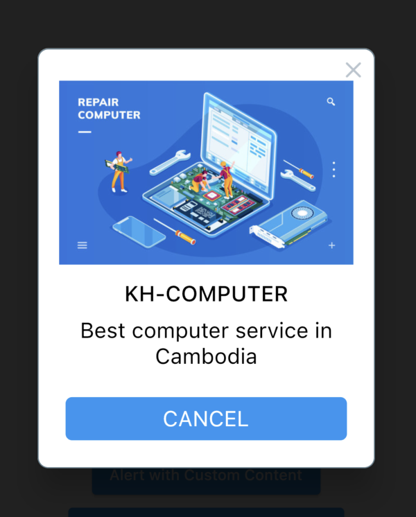
// Alert custom images
_onAlertWithCustomImagePressed(context) {
Alert(
context: context,
title: "KH-COMPUTER",
desc: "Best computer service in Cambodia",
image: Image.network("https://t4.ftcdn.net/jpg/02/76/09/17/360_F_276091725_bBSdFPxTN4kgQnURbbUh77xhvCIYbu93.jpg"),
).show();
}
// Alert custom content
_onAlertWithCustomContentPressed(context) {
Alert(
context: context,
title: "LOGIN",
content: Column(
children: <Widget>[
TextField(
decoration: InputDecoration(
icon: Icon(Icons.account_circle),
labelText: 'Username',
),
),
TextField(
obscureText: true,
decoration: InputDecoration(
icon: Icon(Icons.lock),
labelText: 'Password',
),
),
],
),
buttons: [
DialogButton(
onPressed: () => Navigator.pop(context),
child: Text(
"LOGIN",
style: TextStyle(color: Colors.white, fontSize: 20),
),
)
]).show();
}
// Alert without root navigator
_onAlertWithRootNavigator(BuildContext context) {
Navigator.of(context).push(
PageRouteBuilder(
pageBuilder: (context, animation, secondaryAnimation) =>
CupertinoTabScaffold(
tabBar: CupertinoTabBar(
items: <BottomNavigationBarItem>[
BottomNavigationBarItem(icon: Icon(Icons.account_circle)),
BottomNavigationBarItem(icon: Icon(Icons.search))
],
),
tabBuilder: (BuildContext context, int index) {
return CupertinoTabView(
builder: (BuildContext context) {
return CupertinoPageScaffold(
child: Column(
mainAxisAlignment: MainAxisAlignment.center,
children: [
Text(
"We are inside a CupertinoTabView, which has it's own navigator.",
style: TextStyle(inherit: false, color: Colors.black),
textAlign: TextAlign.center,
),
ElevatedButton(
child: Text('Alert without Root navigator'),
onPressed: () => Alert(
context: context,
title:
"pop() use root navigator ?\n\n* False will pop Alert and stay in CupertinoTabView\n* True will pop Alert and CupertinoTabView",
useRootNavigator: false,
buttons: [
DialogButton(
onPressed: () => Navigator.of(context).pop(),
child: Text(
"false",
style: TextStyle(
color: Colors.white, fontSize: 20),
),
),
DialogButton(
onPressed: () =>
Navigator.of(context, rootNavigator: true)
.pop(),
child: Text(
"true",
style: TextStyle(
color: Colors.white, fontSize: 20),
),
)
]).show(),
),
ElevatedButton(
child: Text('Alert with Root navigator'),
onPressed: () => Alert(
context: context,
title:
"pop() use root navigator ?\n\n* False will pop CupertinoTabView and raise error in the background !\n* True will pop Alert",
useRootNavigator: true,
buttons: [
DialogButton(
onPressed: () => Navigator.of(context).pop(),
child: Text(
"false",
style: TextStyle(
color: Colors.white, fontSize: 20),
),
),
DialogButton(
onPressed: () =>
Navigator.of(context, rootNavigator: true)
.pop(),
child: Text(
"true",
style: TextStyle(
color: Colors.white, fontSize: 20),
),
)
]).show(),
),
],
),
);
},
);
},
),
),
);
}
}
Hey are using WordPress for your blog platform? I’m new to the blog world but I’m trying to get started and create my own. Do you require any html coding knowledge to make your own blog? Any help would be really appreciated!